Every construction or renovation project involves a great number of choices, like determining the colors that best match the desired look of the project.
But choosing colors that work well together isn’t always easy. Making an informed decision when it comes to color is important to avoid having to redo everything because of a design that doesn’t work as well as intended.
Our experts have put together a basic color scheme guide to help you find your perfect color palette. Use this guide to help you plan your work.
Understanding color schemes with color wheels
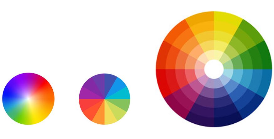
Color wheels
Color wheels can be a very useful tool when it comes to choosing a color palette for a construction or renovation project.
Color wheels consist of three types of colors:
Primary colors
Primary colors are red, blue and yellow. These are called “pure” colors, which means that they cannot be created by mixing other colors.
Secondary colors
Secondary colors are the result of mixing two primary colors. They are orange, green and purple. They appear on the color wheel between the two primary colors used to create them.
Tertiary colors
Tertiary colors are created by mixing secondary colors with primary colors. On the color wheel, they fall between the primary and secondary colors used to create them. Yellow-orange, blue-green and blue-violet are good examples of tertiary colors.
Dimensions of color: for even more interesting combinations
Now that you have a better understanding of the color wheel, you are ready to learn about the different dimensions of color. This will help you understand how all the different color variations that are part of the visible spectrum are created.
Hue
Hue refers to the actual color and the names of colors we use, such as orange, violet, green, indigo, yellow, cyan, etc. Basically, hue is the quality of the color. It is not something that can be measured as greater or lesser.
Luminosity
The luminosity of a color indicates whether it is light or dark. Generally speaking, colors with high luminosity are easier to see.
To better understand this concept, consider that white is the color with the highest luminosity, while black has the lowest.
Saturation
Saturation is the intensity of a color. Less saturated colors are located closer to the center of the axis (on the right circle). In contrast, colors with more saturation are located on the outer perimeter of the color wheel.
For example, if we start from a red with a maximum saturation, we will obtain a pink that becomes increasingly pale as the saturation decreases.
Different types of color schemes
With your new knowledge of color wheels and dimensions of color, you are well equipped to understand how color schemes can be created.
This is because color wheel segmentation is an excellent tool for mixing colors and creating palettes with varying degrees of contrast.
Below are the four most common color schemes. You can use them as a starting point for all your construction or renovation projects.
1 – Monochromatic color scheme
Monochromatic color schemes are the simplest in decorating since they use a single color. However, this color can be broken down into various hues and shades and sometimes associated with touches of black and white.
To draw a parallel with the color wheel, you select a color and then use various shades that appear on the same ray.

Since no other color competes with the chosen shade, the monochromatic scheme is the most understated. This type of palette is an excellent choice if you want to create a harmonious and calming space or unify a room.
2 – Complementary color scheme
Complementary color schemes, sometimes called contrasting palettes, are created by using two opposing colors on the color wheel.

These schemes can be used to create stimulating and fun designs. The effect can vary depending on the dimensions of the contrasting colors chosen.
3 – Triadic color scheme
Triadic color schemes, also called dynamic palettes, are obtained by combining three colors forming a triangle on the color wheel.

The triadic scheme is worth considering if you want to add a bold touch to your project.
4 – Analogous color scheme
An analogous scheme, or harmonic palette, combines colors that are located side by side on the color wheel.

As the colors that make up this type of scheme flow naturally from one to the other, they create a visual harmony.
Find the right sealant color with a practical tool developed by Adfast
When investing a great deal of effort in choosing a color scheme that best matches your desired exterior or interior design, it’s important to leave no stone unturned.
Adfast understands this and we have adapted our sealant selection accordingly. Many of our products, including the Adseal line of silicone sealants, are available in a wide variety of colors to blend perfectly with your design.
We have also developed an easy-to-use online tool to help you find the perfect sealant color. Simply start your color search by entering the shade of your chosen building materials or paint and you will be presented with compatible sealant colors.
You can also start your search by indicating which type of Adseal sealant you want to use (this is important because each type of sealant has unique characteristics). The tool will then present you with several colors of sealant. Clicking on one of these colors will bring up different coatings with a very similar color.
Delta E value for color difference
Our sealant color matching tool is based on the use of the Delta E value. This value is used to evaluate the difference between two colors designated as two points in the CIELAB color space. A Delta E value below 1 is generally considered invisible to the human eye.
Here are some examples of Delta E values:

Our tool displays the color difference between a sealer and the substrate on which it will be applied by giving it a Delta E value.
It will also tell you whether the arrangement is perfect (ΔE 0 – 0.99), satisfactory (ΔE 1 – 1.49) or similar (ΔE 1.5 – 2.4).
For a project with harmonious colors, choose Adfast sealing products!
Are you now more motivated than ever to put color into your projects?
If you want to achieve results that live up to your expectations, choose Adfast sealants to waterproof your new siding, kitchen countertop or shower. Available in a variety of colors to match your décor, they are also effective, durable and easy to apply.
And if you can’t find the color you’re looking for with our sealant color selection tool, please feel free to contact us. We may be able to create it just for you!